What Is a Call to Action?
A call to action (CTA) in marketing and ads is the final, single instruction that tells someone exactly what to do next, like click, buy, or sign up.
Here’s what matters most when you fix your CTA like an operator:
- A CTA is a next step instruction, not a tagline, offer, or value statement.
- Put the CTA at the end as the closing cue, not early-video begging.
- Use one CTA per ad to avoid choice paralysis and drop-offs.
- Write it as verb + specificity + friction removal in one sentence.
- Choose CTA intensity by funnel stage and urgency tolerance, not your preference.
- Measure CTA performance by CVR, then iterate with single-variable testing after 72 hours.
We built Advertisable AI Studio for teams who need control while shipping variations fast: lock Brand DNA, generate a four-beat storyboard from a product URL, then regenerate only the CTA scene to produce 2 to 5 clean versions for Meta, TikTok, and YouTube without changing anything else.
Start by treating the CTA as the clear next step, because clarity at the finish line is what turns attention into downstream action.
A call to action is the clear next step
You will see calls to action everywhere you ship work: ads, landing pages, emails, and organic posts. They show up as buttons, end cards, and even a single in-copy line that tells the viewer exactly what to do next.
The job a CTA performs
A call to action (CTA) is the single clear next step that turns attention into a specific action. If it does not tell the viewer what to do next in plain language, it is not a CTA.
Operationally, a CTA is an instruction, not a suggestion. “Built for busy teams” is a positioning line. “Start free trial” is an action statement. The difference matters because viewers do not execute on vibes. They execute on clarity.
A real CTA also maps to a measurable outcome tied to intent. You should be able to point to the downstream event you want: purchase, add-to-cart, signup, or lead submit. That is what lets you judge the CTA on conversion rate, not on how clever it sounds.
- Pass/fail check: you can prepend “Click to” and the sentence still works (for example, “Click to download the guide”).
- Single-action rule: one verb, one destination, one expected event. If you ask for three things, you create choice friction and you cannot attribute results.
- Measurement check: you can name the success event in your analytics setup (purchase, add_to_cart, complete_registration, lead).
Examples across real channels
CTAs change by channel, but the core is consistent: one explicit verb that matches what the viewer is ready to do. We keep the language tight because the job is routing, not persuasion.
For ecommerce, the action is transactional and the outcome is unambiguous. “Shop now” and “Add to cart” are both valid, but they imply different intent levels: browsing versus committing an item to checkout.
For SaaS and lead gen, you are usually moving someone into a tracked evaluation step. “Book a demo” is high-intent and sales-assisted. “Start free trial” is self-serve and should map cleanly to a signup completion event.
For content-led funnels, you are often trading value for a softer commitment. “Download the guide” is a direct asset exchange. “Learn more” is acceptable when the next page is genuinely educational, but it must still map to a measurable path (time on page alone is not a conversion event).
- Ads: button text like “Shop now” or an end card line like “Add to cart.”
- Landing pages: above-the-fold primary button like “Start free trial” or “Book a demo.”
- Emails: a single primary button like “Download the guide.”
- Posts: an in-copy instruction like “Learn more” that leads to one focused next step.
What a CTA is not, and why it annoys people
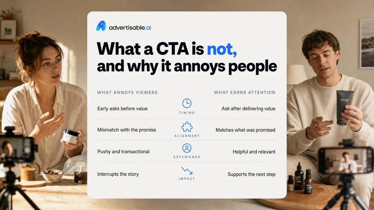
Most audience resistance comes from timing and mismatch. Early-video begging ("like, subscribe, buy") feels like you are collecting payment before delivering the promised outcome, so viewers bounce.
A closing cue earns attention because it arrives after you have shown the product and removed doubt. It also has to match what you promised: if you teased a 60-second demo, the next step cannot suddenly be “buy now” without creating whiplash and lowering watch time.
Taglines and benefits are not CTAs
A tagline is brand positioning. A CTA is a next step. Mixing them up creates confusion because the viewer hears a claim but never receives an instruction.
We see this when teams end on a value statement ("Better skin in 7 days") with no action statement attached. It can be true and still fail as a close, because the viewer does not know what you want them to do in the next 2 seconds.
Hype language makes this worse: "Don’t miss out" or "Best ever" increases pressure without giving direction. Pressure without clarity reads as pushy, not persuasive.
- Brand line: what you stand for (identity)
- Benefit line: what improves for the buyer (outcome)
- CTA: what to do next (single, measurable action)
If your last line cannot be mapped to a trackable click, signup, or purchase, it is not a CTA, even if it sounds compelling.
Multiple asks create decision paralysis
Multiple CTAs are not “more chances,” they are competing instructions. Three buttons means zero priority, and the viewer chooses to do nothing.
This also hurts measurement. When one video says “Shop now,” “Learn more,” and “Follow for tips,” you have competing intents, a diluted signal, and you cannot attribute CVR shifts to a single change.
The fix is operational: pick one primary action, then test it. recent CTA performance data shows emails with a single CTA can increase sales by 1,617% compared to emails with multiple CTAs, which matches what we see in performance creative: clarity beats options.
- Choose the one action that matches the promised outcome (purchase, signup, download)
- Keep the rest of the closing constant and only swap the CTA line in a 2-5 variant batch
- Read results after 48-72 hours using CVR, not CTR
Why every ad needs one clear bridge to action
In performance creative, the call to action (CTA) is the fourth beat: it turns the attention you paid for into a measurable next step. For that to happen, the action has to be obvious and singular, not a menu of options.
Interest does not equal action
An interested viewer still will not move unless you remove uncertainty. When the next step is unclear, behavior stalls because the viewer is forced to decide what you want them to do and what happens after they do it.
In paid social, the default action is always the same: keep scrolling. You do not get “extra credit” for being intriguing if the ad ends without a direct action statement that closes the loop.
Clarity works because it reduces cognitive load. A single instruction lets the viewer stay in motion: understand, click, complete. When you treat the CTA as the final beat (not an afterthought), you protect the spend that earned attention in the first place.
- Good: one next step tied to one outcome (start a trial, get a quote, buy with free shipping).
- Risky: multiple asks in one ending (visit the site, follow, subscribe, DM, and read reviews).
- QA check before export: in the last 2 seconds, a viewer should be able to say the exact next step after one watch.
Vague CTAs waste paid attention
Vague CTAs spend your budget twice: first to win attention, then again to re-educate the click. The conversion gap shows up when you pay for engagement that never connects to an intentful next step, a dynamic captured well in marketing conversion research.
“Learn more” is not wrong, but it is incomplete when the destination is unclear. If the click lands on a generic homepage, a blog index, or an unfocused product category, you have created a second decision point that most people will not complete.
“Click here” creates the same issue in reverse. It signals action without signaling benefit, so you may get CTR without downstream conversion rate (CVR). Watch time can be the worst trap: a strong video that never presents a conversion path can outperform on engagement while underperforming on outcomes.
- Acceptance criteria: the CTA language, the on-screen button, and the landing destination all point to the same single outcome.
- 48-72 hour readout: hold the rest of the ad constant and swap only the CTA beat; decide by CVR, not clicks or watch time.
- Next-test decision: if CTR is stable but CVR drops, tighten destination clarity or add a friction remover (free trial, no credit card, free returns).
What makes a CTA effective: clear, single, low friction
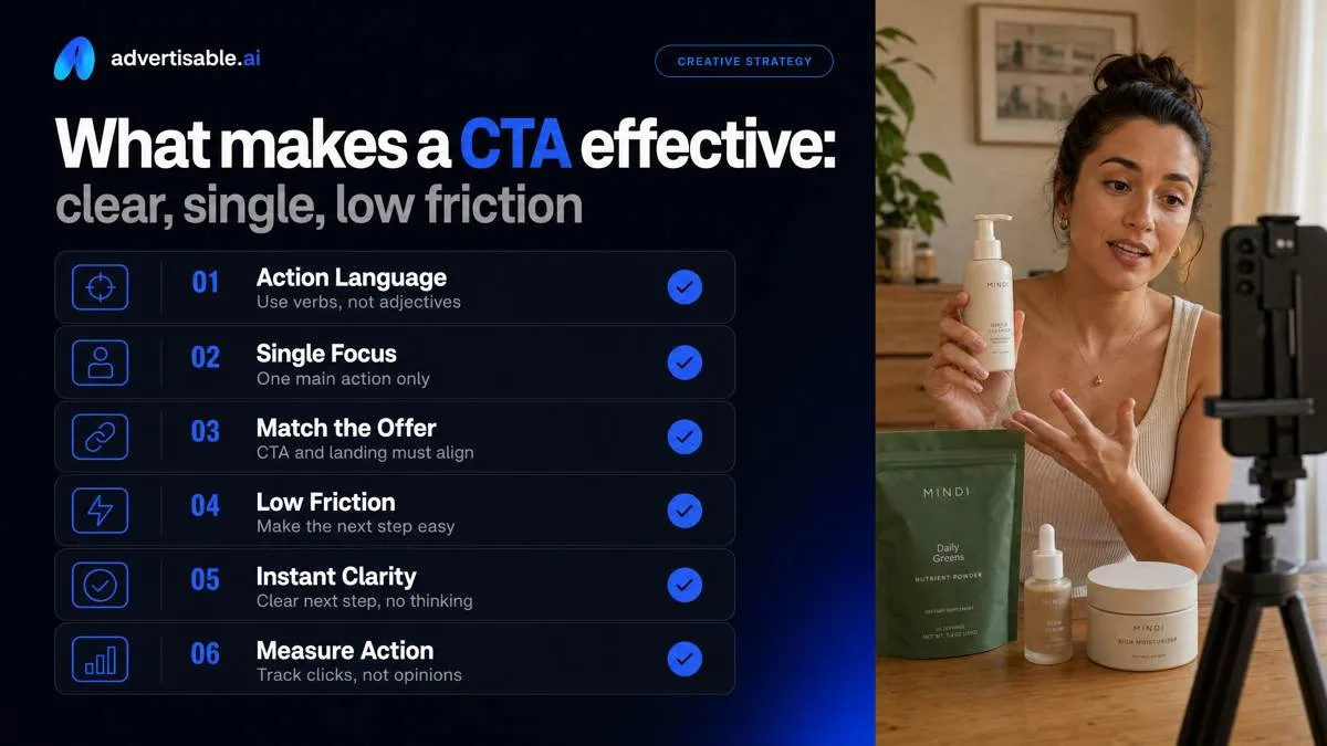
An effective call to action is action language, not persuasion language. You are not re-selling the offer in the final beat; you are issuing a clear next-step instruction that a viewer can follow without thinking.
That only works when the CTA matches the offer and the landing step. If the ad promises a trial but the click goes to a pricing page, or the CTA says “Book” but the page starts with an email capture, you create friction where you needed momentum.
Clarity and specificity standards
A clear CTA names one exact next step and says what happens immediately after the click. Your acceptance criteria is simple: a viewer should be able to repeat the instruction verbatim after one hearing and predict the next screen within 2 seconds.
We QA this by stripping any verb that could mean five different things. “Explore,” “Discover,” “Check it out,” and “See more” are ambiguous because they do not define the action or the outcome. Replace them with a direct instruction tied to the landing action and the first on-page task.
- Name the exact next step: “Start your 7-day trial,” “Book a demo,” “Download the guide,” “Add to cart”
- State what happens next: “You’ll answer 3 questions,” “You’ll see plans and pricing,” “You’ll get instant access”
- Remove ambiguous verbs: swap “Learn” for “Watch the 90-second walkthrough,” swap “Join” for “Create your account”
One primary action only
One message gets one goal. When you stack actions, you do not increase options; you split attention and create choice paralysis, which shows up as weaker conversion rate even if click-through rate looks fine.
This is why single-CTA discipline is measurable in channels like email: recent CTA performance data shows emails with a single CTA can increase sales by 1,617% compared to emails with multiple CTAs. The mechanism carries over to short-form video because the decision is still binary: do the next step or keep scrolling.
Operationally, we treat secondary links as support content, not competing actions. Keep them visually lighter, later in the experience (landing page footer, post-submit screen), or off the primary creative entirely. Then make the end-of-ad cue consistent so viewers learn where the instruction lives.
- Hold one goal constant per ad: purchase, trial start, booking, or download
- De-emphasise secondary links: smaller text, lower contrast, or moved to the landing page after the primary action is complete
- Use a consistent end cue: same final scene position, same on-screen button area, same voiceover cadence so the viewer anticipates the instruction
Verb benefit friction formula
Use a build formula you can apply across offers: Verb + Benefit + Friction remover. Keep it to one sentence so you can test it as a single variable and read results cleanly after a 48 to 72 hour window.
Start with a verb that matches intent. “Get” fits immediate receipt, “Start” fits activation (trial or onboarding), and “Book” fits scheduled commitment. Then state the benefit in concrete terms: what you receive, not what you become.
Finish by removing one operational friction point that would otherwise stall the click. Pick the most likely blocker for your offer: shipping cost and timing, trial requirements, or risk language (returns, cancellation, refund).
- Get: “Get the starter kit with free shipping”
- Start: “Start your 7-day free trial, no credit card”
- Book: “Book a 15-minute demo, pick a time now”
- Benefit options: “instant access,” “the 5-step checklist,” “your first order,” “a personalized plan”
- Friction removers: “free shipping,” “no credit card,” “cancel anytime,” “money-back guarantee,” “free returns”
Common CTA types, chosen by goal and funnel stage
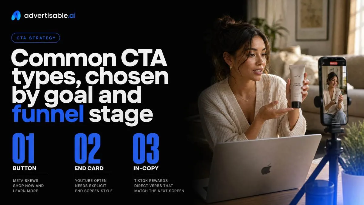
Your CTA can live as a tappable button, a spoken and on-screen end card, or a single in-copy action statement. Write it in the platform’s native language: Meta skews “Shop now” and “Learn more,” TikTok rewards direct verbs that match the next screen, and YouTube often needs an explicit end-screen style instruction.
Goal-based CTA categories
Pick your CTA category by the one outcome you will judge on Conversion Rate (CVR). The category determines how much operational friction you are asking the viewer to accept in one step.
Use buy CTAs when the landing page is a transaction path you trust: “Buy now” or “Add to cart.” Use lead CTAs when the next step is a form or sales touch: “Book a demo” or “Get quote.” Use education CTAs when you are reducing uncertainty before any commitment: “Learn more” or “Watch tutorial.”
Acceptance criteria in production is simple: one category per ad, one action per end card, and the click path matches the promise (no “Book a demo” that dumps into a pricing grid).
- Buy: Buy now; Add to cart
- Lead: Book a demo; Get quote
- Education: Learn more; Watch tutorial
Match CTA to funnel temperature
Funnel temperature is your intensity dial. Cold audiences need low-friction next steps (learn or watch). Warm audiences can handle a small commitment (start trial or quiz).
Hot audiences are ready for a purchase ask, ideally with an urgency cue.
Operationally, keep your creative batch controlled: hold the ad body constant and ship 2 to 5 CTA-only variants, then read CVR after 48-72 hours.
Examples by temperature:
- Cold: Learn more; Watch tutorial
- Warm: Start trial; Take the quiz
- Hot: Buy now, limited-time offer; Add to cart today
The moment you ask for a hotter action than the audience is ready for, you often trade cheap clicks for weak downstream conversions.
How to judge a CTA by CVR, then iterate cleanly
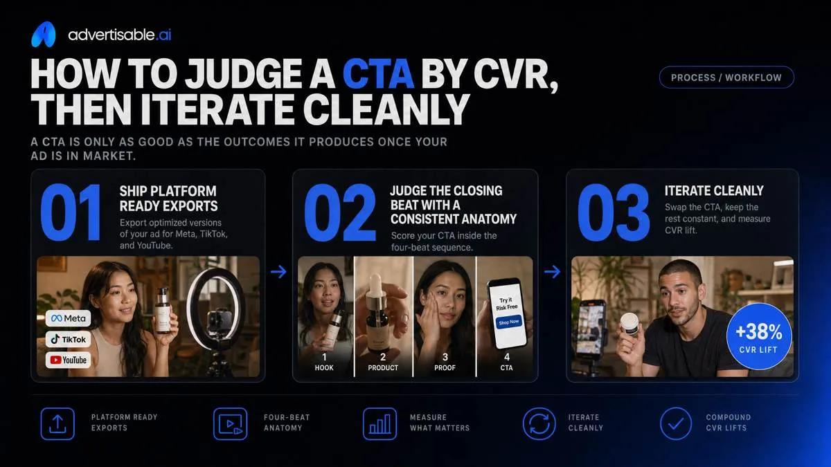
A CTA is only as good as the outcomes it produces once your ad is in market. That is why we ship platform-ready exports for Meta, TikTok, and YouTube, then judge the closing beat inside a consistent four-beat anatomy: hook, product, proof, CTA.
Measure outcomes, not clicks
Use Conversion Rate (CVR) as your primary readout for the CTA, because the CTA’s job is to convert the action, not collect attention. A high click-through rate (CTR) can still be a losing CTA if those clicks do not become purchases, signups, or leads.
CTR is a weak proxy because it over-rewards curiosity and under-penalizes friction. We see this when a CTA like “Learn more” drives cheap clicks, but the landing step is unclear, the offer feels mismatched, or the form is longer than viewers expected.
Your measurement only works if the conversion event matches the intended next step. Align the CTA language to the event you are optimizing so you are not paying to train the algorithm on the wrong behavior.
- Purchase CTA: optimize to Purchase CVR, not Link Clicks (example: “Buy now” should map to a purchase event, not just a product page view).
- Signup CTA: optimize to Complete Registration CVR (example: “Start free trial” should map to a completed account, not a button click).
- Lead CTA: optimize to Lead or Submit Application CVR (example: “Get a quote” should map to a submitted form).
- QA check: confirm the event fires once per conversion, is attributed to the correct campaign, and is consistent across platforms before you compare creatives.
One-variable CTA readouts
A clean CTA test changes one thing: the CTA beat. If you change the hook, proof, and CTA together, you cannot tell which change helped or hurt, and that is how you waste spend without learning.
Hold the hook and proof constant so your audience, promise, and credibility signal do not move. Then swap only the closing instruction: the verb, the specificity of what happens next, or the friction remover (free trial, no credit card, free returns, instant access).
Run the variants at the same time and read results after 72 hours. That window is long enough to stabilize early delivery noise, while still short enough to keep iteration moving.
- Build 2-5 versions labeled CTA_A, CTA_B, CTA_C so results stay traceable.
- Keep identical: first 3 beats, offer details, landing page, targeting, placements, budget, and conversion event.
- Change only: the final on-screen line and voiceover in the CTA beat.
- Decision rule: pick the winner by highest CVR at comparable spend, and only then run a new CTA batch or move on to testing a different beat.
Where Advertisable fits in
Execution breaks most testing plans, not the strategy. The fastest way to keep tests clean is to produce platform-ready variants where only the CTA scene changes and everything else stays locked.
In Advertisable AI Studio, you can import a product URL to pull in product facts and assets, then lock Brand DNA guardrails so claims and tone do not drift across versions. That matters operationally, because inconsistent wording can create “false winners” that look better for the wrong reasons.
The practical advantage is frame-by-frame control: generate your base storyboard once, then regenerate only the CTA beat to create controlled variants for Meta, TikTok, and YouTube without rebuilding the entire ad.
- Acceptance criteria: the last scene is the only scene that differs across files, the conversion event is identical, and the exports are correctly formatted per platform before launch.
- Iteration discipline: do not introduce a new hook or new proof element until you have a CTA winner on CVR.
Turn your CTA into a controlled conversion test
If your CTA is the fourth beat, you should treat it like an operator, not a copywriter. Pick one objective metric first: Conversion Rate (CVR). Then run a clean workflow: paste your product URL into Advertisable AI Studio, lock Brand DNA so claims and voice stay constant, and generate a storyboard that follows the four-beat anatomy.
Next, create 2 to 5 CTA variations by regenerating only the CTA scene. Hold the hook, product moment, and proof element constant. Export platform-ready versions for Meta, TikTok, and YouTube. Launch them together to the same audience and read results after 72 hours.
Your acceptance criteria is simple: the winner is the CTA with the highest CVR, not the one that earns the most clicks.
Frequently Asked Questions
### What is a call to action example?
A call to action example is a single action statement that tells your viewer exactly what to do next, like “Start your free trial” or “Buy now.” In performance ads, it belongs in the final beat and should map to one measurable outcome.
### How do you do a call to action?
You write one clear instruction using a simple formula: action verb plus specificity plus friction removal. Then you test it as one variable by holding the rest of the ad constant and judging success by CVR after a 48 to 72 hour readout.
### What is the difference between a CTA and a hook?
A hook earns attention at the start by signaling relevance, while a Call-to-Action (CTA) closes the ad by telling the viewer the next step. If you blur them together, you usually pay for clicks that do not convert downstream.
### How specific should my CTA be?
Specific enough that the viewer knows exactly what happens after the click, not just the general intent. “Learn more” is vague, while “See the 5-step setup in 90 seconds” sets a clear expectation and typically reduces friction.