High-Converting Ad Formats: How to Choose the Right One
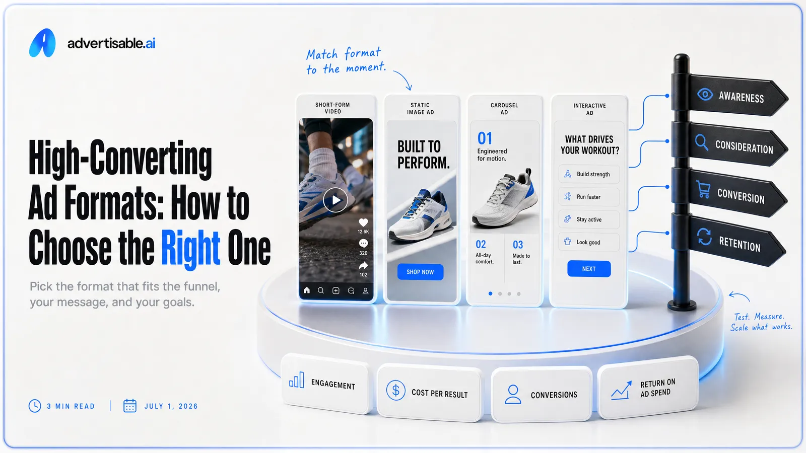
The ad formats that reliably convert are the ones that match your funnel stage and let you run fast, controlled, one-variable tests, usually starting with the hook.
Here’s what matters most right now:
- Pick your format by stage and objective, not what is trending this week.
- Keep the four beats fixed: hook, product moment, proof element, CTA.
- Test 10 to 20 hook variants against one identical body for clean comparisons.
- Read results in 48 to 72 hours using thumb stop, CTR, and CVR together.
- Refresh when fatigue shows up as falling thumb stop before CVR collapses.
- Protect conversion quality by keeping claims accurate and visuals on-brand.
The good news: you do not need a bigger budget or a new audience to fix this. You need a way to match the right format to your situation, then iterate the hook fast without breaking what already works. That is what the rest of this guide walks through.
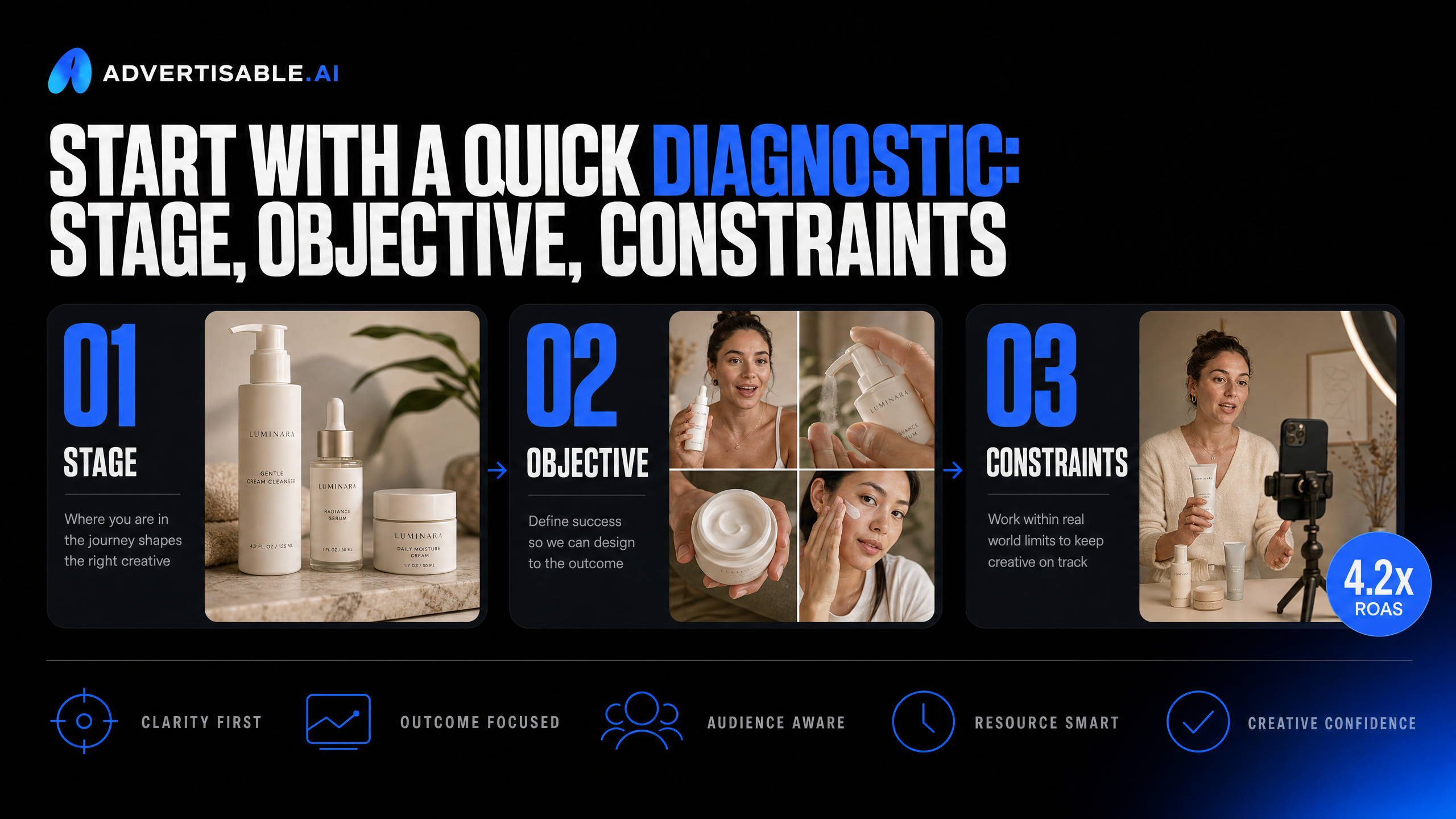
Start with a quick diagnostic that makes the choice obvious: your funnel stage, your objective, and the constraints that decide which formats you can realistically iterate fast.
Start with a quick diagnostic: stage, objective, constraints
Stage + objective in one sentence
Pick a format by writing one sentence: “My audience is at [cold/warm/hot], and my objective is [get attention/earn trust/drive action] without changing targeting.” That sentence prevents you from forcing a bottom-funnel format into a top-funnel job.
A practical way to label stage: cold audiences need fast clarity and a reason to care, warm audiences need proof that reduces doubt, and hot audiences need a tight offer and a clear next step.
Your objective should be singular for the next test batch. If you try to increase thumb stop, click intent, and conversion in the same creative, you will not know what actually moved the needle.
- Cold + awareness: earn the first 2 seconds and establish relevance
- Warm + consideration: make the promise believable with one strong proof element
- Hot + conversion: remove friction with specifics (what you get, what to do next)
The biggest conversion blocker
The single biggest conversion blocker we see is a mismatch between the hook and the landing-page reality. You win the click with a big promise, then lose the purchase because the product moment and proof do not reconcile that promise fast enough.
This usually shows up as decent attention but weak downstream performance: viewers do not understand what the product is early, they cannot repeat back the value prop, or the proof feels detached from the claim. It is not a “format” problem as much as a credibility gap inside the first few scenes.
- Hook is abstract: it signals curiosity, not a concrete outcome
- Product moment is late or vague: the viewer still does not know what you sell
- Proof element is missing or misaligned: the claim is unsupported
- CTA is diluted: multiple actions or no clear next step
Constraints that change the best format
Your constraints decide your best-performing format as much as your funnel stage. The “right” choice is the one you can produce at volume, keep on-brand, and iterate with controlled, one-variable tests.
Be explicit about what you cannot do right now, because that determines whether you should lean into creator-style talking ads, product-forward visuals, or static templates.
- Creative velocity: if you need 10 to 20 variants fast, prioritize formats with easy hook swaps
- Accuracy risk: if claims and specs must be tight, choose formats that keep the product moment precise and consistent
- Asset availability: if you have limited product imagery, pick formats that can carry more of the message in on-screen text and structure
- Team bandwidth: if reviews and edits are your bottleneck, pick simpler creative anatomy with fewer moving parts
- Placement needs: if you must cover multiple aspect ratios, formats with sound-off readability and clean framing travel better
What makes ad formats convert: the match and the anatomy
Match proof type to decision risk
High conversion comes from the right proof for the risk your buyer feels. When the decision risk is high, your ad has to reduce uncertainty, not just create interest.
We see teams overuse one proof style everywhere, then wonder why a format “stopped working.” The format is rarely the issue. The proof is mismatched to the moment.
Use proof as a dial: the higher the perceived cost of being wrong (money, time, reputation, health), the more you need concrete, verifiable evidence, and the earlier it should appear.
- Low-risk buys: fast, tangible proof (a clear demo, a specific result, a simple visual before/after) so the viewer can decide without deep research
- Medium-risk buys: mechanism plus detail (how it works, what’s included, what it replaces) to justify switching costs
- High-risk buys: credibility proof (third-party validation, precise specs, clear constraints, refunds/guarantees) because skepticism is rational
- Warm audiences: comparison proof (why you vs alternatives) because they already believe the category, not necessarily your brand
The four beats that carry conversion
Most converting formats are the same skeleton in different clothes. The ad wins when it hits four beats cleanly: Hook, Product Moment, Proof Element, CTA.
The Hook is your two-second promise. Make it repeatable out loud and specific enough that someone can instantly judge relevance.
The Product Moment should arrive early and be literal. Viewers need to see what it is and what it does before they’ll grant you more attention.
Proof is where you earn belief. Then the CTA gives one instruction, not a menu of next steps.
- Hook: one promise, one angle, written for sound-off readability
- Product Moment: show the product early, tie it directly to the promise
- Proof Element: one believable reason to trust the promise (not five weak ones)
- CTA: a single action aligned to the stage (shop, start trial, get details)
Why accuracy protects conversion quality
Accuracy does not just prevent complaints. It prevents the worst outcome in performance marketing: ads that “convert” the wrong people and then fall apart downstream.
In practice, small inaccuracies create big leakage: mismatched variants, wrong specs, overbroad claims, or visuals that drift off-brand. You may see clicks or even initial purchases, but you pay for it in refunds, support volume, chargebacks, and churn.
This is where production speed has to come with controls. At volume, you want your brand rules - fonts, colors, logos, voice, and product specs — locked so scale does not introduce drift, and you want to be able to change one scene without accidentally altering the rest of the message.
- Keep claims tight enough to verify from your own product page and policies
- Make the Product Moment match reality: packaging, inclusions, and key specs
- Avoid “proof theater”: numbers, badges, and comparisons you cannot defend
- Audit every variation for one thing: does it promise exactly what the landing page delivers?
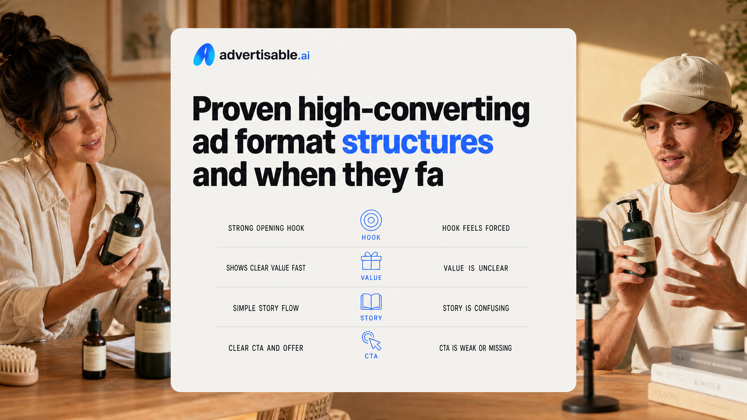
Proven high-converting ad format structures and when they fail
Problem-solution demos (and the ceiling they hit)
Problem-solution demos convert because they reduce uncertainty fast: you show the pain, introduce the product moment early, then prove the fix. They fail when the “problem” is too broad or the solution needs nuance you cannot communicate in a few scenes.
In our experience, the limit shows up when your demo becomes a list of features instead of a single, repeatable outcome. Keep one promise per ad, and make the proof element match the promise (not adjacent benefits).
- Works best when the result is visible or easily understood in one step
- Fails when usage context changes the outcome (fit, routine, environment) and you skip those constraints
- Fails when the product reveal comes late and viewers feel bait-and-switched
UGC-style testimonials and trust failure modes
UGC-style testimonial ads work because they borrow the structure of real recommendations: a relatable person, a specific claim, and a reason to believe. They fail the moment viewers sense the “review” is scripted, exaggerated, or uncheckable.
You do not need more excitement. You need tighter specificity and claim discipline: what changed, over what timeframe, and what the product did (and did not) do. A Nielsen consumer trust study puts the bar in plain terms: 92% of consumers trust recommendations from friends and family more than any form of advertising, so anything that feels like an ad-read breaks the spell.
- Use concrete constraints: “day 3,” “first week,” “after two uses,” not timeless praise
- Match on-screen text to spoken claims for sound-off readability and consistency
- Avoid absolute outcomes unless you can show the proof element in-frame
Founder-direct: the story can backfire
Founder-direct ads can be high-converting because you compress positioning, credibility, and objection handling into one face-to-camera narrative. They backfire when the story becomes the product, and viewers never get a crisp product moment tied to a single promise.
The most common miss we see is a long “why we started” intro followed by a vague CTA. If your founder message cannot land the hook and the proof element quickly, it turns into a brand film that performs like one.
- Backfires when the story is about you, not the buyer’s job-to-be-done
- Backfires when you rely on credentials instead of showing what changes
- Backfires when the offer and next step are unclear or buried
Before-after: proof is the whole point
Before-after works when the “after” is undeniable and clearly attributable to the product. It fails when the transformation is subtle, subjective, or easy to dismiss as lighting, angles, or selective examples.
You need proof you can show, not just say. The proof element can be the side-by-side itself, a time-stamped progression, or a screen capture of measurable output, but it must be legible on a phone.
- Same framing and conditions (angle, distance, background) so the change reads as real
- A clear timeframe on-screen so viewers know what they are looking at
- A mechanism tie-in: one sentence that explains why the change happened
Listicle-comparison for research-driven buyers
Listicle-comparison formats convert when the buyer is already in evaluation mode and wants trade-offs, not hype. They fail when every option “wins,” or when you compare features that do not map to outcomes.
Treat it like procurement: define the evaluation criteria, then show where each option fits. This is also a format where holding the body constant and swapping only the hook lets you test which comparison angle actually earns the thumb stop.
- Compare by decision criteria (time to value, learning curve, proof available), not feature lists
- Include one “who should not buy” line to signal honesty
- Keep the CTA singular: pick the next step you want, not three options
Decision matrix: choose formats without guessing
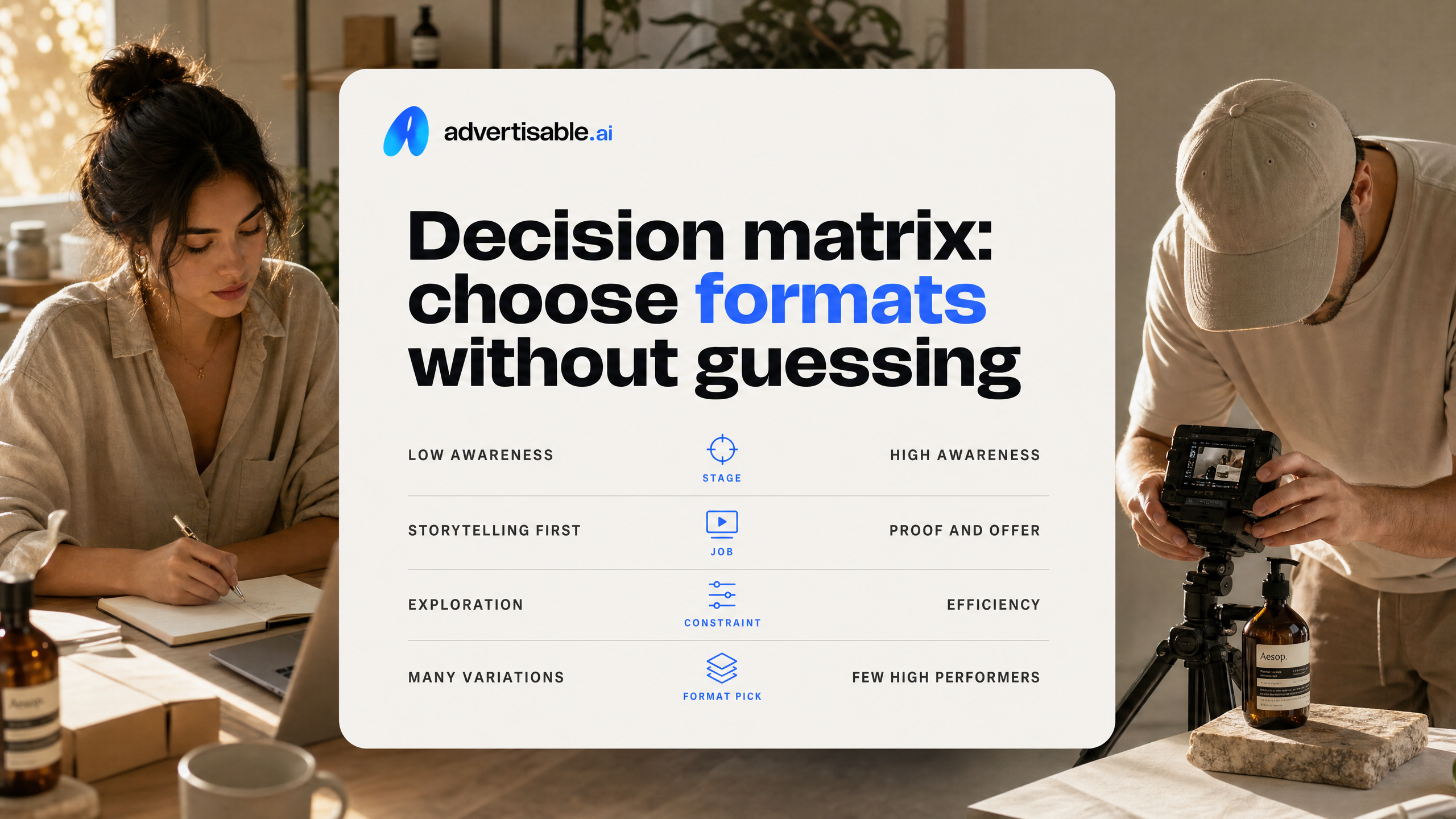
Pick formats like you pick targeting: based on the job they need to do and the constraints you are under. Use stage first, then choose the format that lets you ship enough variations to get signal before fatigue.
Format-by-stage matching grid
Your funnel stage should pick your format, not your personal preference. Cold needs fast comprehension and a clean promise; warm needs proof that answers objections; bottom-funnel needs specificity and a clear next step.
Use this grid as the default. You can still test outside it, but this keeps your first batch from becoming a random mix of creative types.
- Cold (prospecting): UGC-style ads (hook-forward), problem-solution demo, before/after, short comparison, B-Roll style ads with on-screen promise for sound-off
- Warm (retargeting): product demos with proof element, comparison ads (vs old way or alternative), founder story with credibility, static advertorial-style images that summarize claims + proof
- Bottom-funnel (decision): offer-stack video or static, catalog/DPA paired with a proof-focused video, FAQ-style creator-style ad that handles 2-3 buying objections, carousel that sequences benefits to proof to CTA
Effort vs fatigue risk: the real tradeoff
Effort is not just production time. It is how hard it is to iterate one variable without breaking everything else. Formats that are hard to version tend to fatigue faster because you refresh less often and the audience sees the same beats repeatedly.
In our experience, the safest path is a format where the hook is modular and the rest of the creative stays stable. That is why creator-style videos and structured product ads tend to scale better than “one perfect video” attempts.
- Lowest effort, lowest fatigue risk: static templates and modular videos where you can swap only scene 1 (hook) while keeping product moment, proof, and CTA fixed
- Medium effort, medium fatigue risk: carousels and comparison ads, because each card or scene has to stay coherent across variants
- Highest effort, highest fatigue risk: narrative-heavy founder stories and long demos, because editing and pacing changes ripple through the entire timeline
When signals misalign: what to switch first
Misalignment shows up as a metric mismatch: strong thumb stop but weak clicks, or solid clicks but no conversions. When that happens, do not rewrite the whole ad. Switch the smallest format component that matches the failure point.
Keep the 4-beat anatomy intact and change one lever at a time. With scene-level control, you can regenerate only the failing scene instead of resetting learning with a completely new concept.
- Thumb stop is high, CTR is low: switch to a clearer hook type (one concrete promise) and move the product moment earlier
- CTR is fine, conversions are weak: switch proof format (demo, comparison, specific claim support) before changing the hook
- Good conversion rate, volume stalls: switch format to a broader top-of-funnel wrapper (UGC-style or B-Roll) while keeping the same core promise
- Performance drops fast after a few days: keep the body identical and rotate hook variants, so production speed does not become the bottleneck that stops you refreshing before fatigue hits
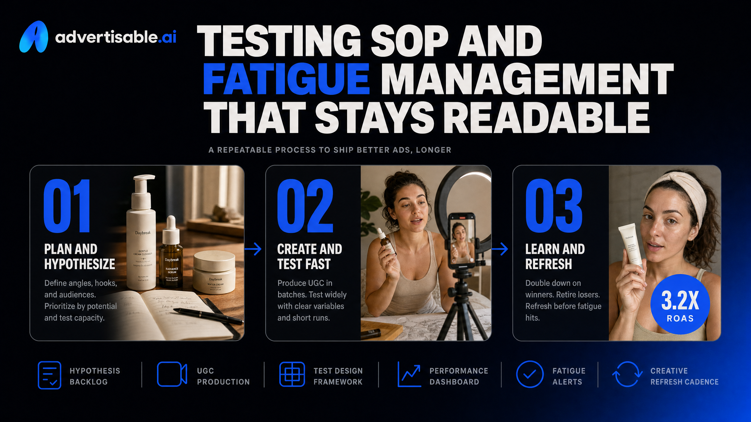
Testing SOP and fatigue management that stays readable
Hook-only batches, identical bodies
The fastest clean test in paid social is a hook-only batch: you generate 10 to 20 hook variations, but you keep the rest of the ad identical. That isolates the two-second promise as the only variable, so your read is signal, not noise.
In practice, you lock the same Product Moment, Proof Element, and CTA across every variant. You are not “testing creative,” you are testing a single promise against a fixed creative anatomy. It is also the easiest workflow to scale because you are regenerating one scene instead of rebuilding full timelines.
- Build one approved storyboard: Hook (scene 1), Product Moment (scene 2), Proof Element (scene 3), CTA (scene 4)
- Generate hook variants that change only one thing: the promise or framing, not the offer, not the proof, not the product details
- Keep runtime, on-screen text density, and first product reveal timing consistent so the platform is not optimizing for different viewing behavior
- Name files so you can read results fast: Hook-A, Hook-B, etc., with the same body version tag
48 to 72 hour reads for clean comparisons
You do not need a week of waiting to pick winners. For accounts spending enough to gather meaningful delivery, 48-72 hours is usually enough for directional reads on which hook earns attention and clicks.
The rule is simple: compare like with like. Run the hooks in the same campaign, same optimization event, same placements, and overlapping time windows. Once you start swapping audiences or changing budgets mid-test, you are no longer evaluating the hook.
What we look for first is the early funnel signal (thumb stop and CTR), then whether that translates into downstream efficiency. A hook that spikes clicks but tanks conversion quality is not a winner, it is a mismatch between promise and product moment.
Fatigue signals and rotation rules
Fatigue is not a vibe, it is a pattern: the same creative keeps serving, and performance degrades as the audience saturates. Your job is to spot it early and rotate with rules, not panic edits.
Watch for a sustained drop in CTR or conversion rate while CPM and targeting stay relatively stable. Also watch comments and saves: when people start repeating the same objections, your hook is no longer earning fresh attention.
- Rotate on a schedule: keep 3 to 5 active winners per concept, swap in 1 to 2 new hooks every 2 to 3 days
- Do not “refresh” everything at once: change hooks first, then test proof, then CTA, one variable per cycle
- Retire variants that underperform for two consecutive read windows, even if you personally like them
- When a winner fades, keep the body and regenerate scene 1 before you rebuild the whole ad
This is where scene-level swapping pays off: you protect what is working and only replace the part the audience has already learned to ignore.
Turn your next creative refresh into a controlled sprint
If your results have plateaued, the fix is rarely a new audience. It is a tighter system for shipping and testing formats fast, with clean, one-variable reads that tell you what actually moved performance.
That is exactly what we built Advertisable AI for. You set up Brand DNA once so every export stays on-brand and claim-accurate. You approve one storyboard with full scene-level control.
Then you generate 10 hook variations against the same body, export platform-native ratios for Meta, TikTok, and YouTube, and launch a 48 to 72 hour test batch.
Stop guessing which format is “the winner.” Start iterating the parts that create lift, starting with the two-second Hook.
Frequently Asked Questions
Q: What's the difference between UGC-style ads and Product ads?
A: UGC-style ads put an AI Avatar front and center so you can iterate Hook angles while keeping the same on-screen “creator” consistent. Product ads start from a product URL and prioritize accurate product details and visuals, letting you test selling angles anchored to what you actually sell.
Q: Can I regenerate just one scene without redoing the whole ad?
A: Yes. In Advertisable AI, you can regenerate a single scene like the Hook while keeping the Product Moment, Proof Element, and CTA identical. That keeps your tests clean so you can attribute performance changes to one variable.
Q: What is Brand DNA and why does it matter?
A: Brand DNA is your locked brand specifications, including colors, fonts, logos, voice, and product specs. It matters because it keeps every variation consistent and accurate, so you can scale testing without introducing off-brand visuals or risky claims.